您需要 登录 才可以下载或查看,没有账号?注册
更多精彩内容需要登录后查看
使用道具 举报
Geass-CC 发表于 2013-3-10 13:04 最近国内国外都在设计logo啊
wangpeiyu 发表于 2013-3-10 14:18 国内具体是指哪些?
Geass-CC 发表于 2013-3-10 14:32 HDC,CHD这些啊
本版积分规则 发表回复 回帖并转播 回帖后跳转到最后一页
0
7432
给予过论坛支持和贡献的用户
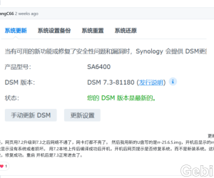 rr的25.9.7的sa6400升级7.3成功。arc的3.0.1664 人气#黑群晖
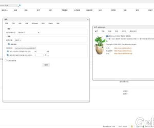 DSM6 套件版qbittorrent 5.0.53746 人气#黑群晖
 BTSCHOOL开放注册2天474 人气#PTer交流
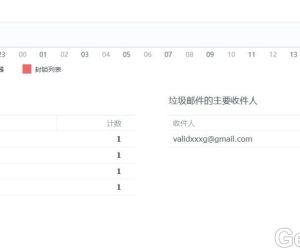 mailserverplus 破解版真不能用看图2212 人气#黑群晖


 提升卡
提升卡 置顶卡
置顶卡 沉默卡
沉默卡 喧嚣卡
喧嚣卡 变色卡
变色卡